
Visualizing trade-offs in multi-property protein optimization
Visualizing trade-offs in multi-property protein optimization
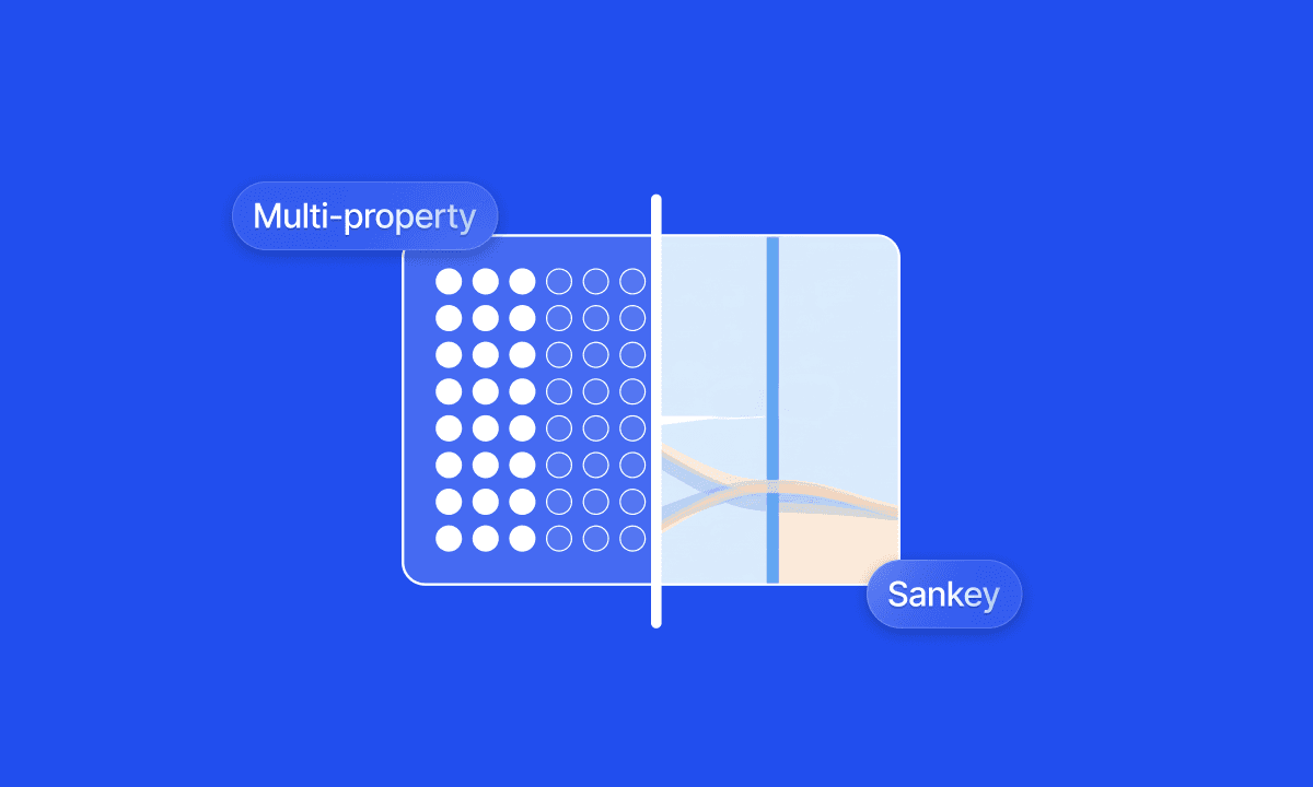
For AI-driven multi-property protein optimization to be effective, scientists need to be able to visualize where trade-offs are made, and where adjustments might be necessary. We built Sankey plots into Cradle's workflow to make that visible, and to allow scientists to make the adjustments themselves.

Dave
Dave
A lead candidate with exceptional on-target activity that fails in process development six months later is a common result of sequential property optimization. Optimizing binding first, then function, then developability, then expression treats each property as independent when, in practice, they are deeply coupled.
There are significant downstream effects of this step-by-step protein optimization:
Designs tend to cluster in small areas of proteomic space, which can miss completely novel changes that may not be readily apparent
R&D timelines become longer, because every optimization step has to be validated in the wet lab
Molecules ultimately do not fully meet the desired target product profile (TPP)
Multi-property optimization is a key use case for AI-driven protein optimization: AI thrives in the multi-parametric sequence space that is difficult to grasp for human scientists alone. But whether scientists can steer that exploration toward designs that satisfy all constraints simultaneously or not requires visibility into where designs are succeeding and where they are failing, before any of them reach the bench.
Sankey plots as an audit layer
At Cradle, we use Sankey plots as a core visualization for multi-property generation campaigns. The concept is straightforward: think of your generated sequences as a river flowing through a series of filters. Each vertical bar on the x-axis represents one of your defined objectives; on-target activity, expression level, stability, a safety constraint, a developability threshold. The flowing bands are your sequences. Blue means the sequence passes the filter; orange means it fails.
[Figure 1: Example Sankey plot showing sequence flow across multiple objectives]
What makes this immediately useful is pattern recognition. If the river turns predominantly orange at a specific constraint, you have identified the bottleneck in your design space, not by reading through hundreds of rows in a spreadsheet, but at a glance. More importantly, the Sankey plot becomes a decision-making tool. It tells you which constraint to interrogate, which parameter to relax, and where the AI needs more room to manoeuvre.
An important caveat: these are predicted outcomes. The sequences flowing through the Sankey plot have not yet been synthesized or tested, which is what our customers do in their wet lab. What it gives you is high confidence going into a wet lab round: you have eliminated designs that were dead on arrival and focused your experimental budget on the sequences most likely to meet your full target product profile. That distinction matters, because the value is not in replacing experimental validation but in making each round of it count.
Let’s look into two practical examples of exactly that. The data is fictitious, but both examples are based on real case studies.
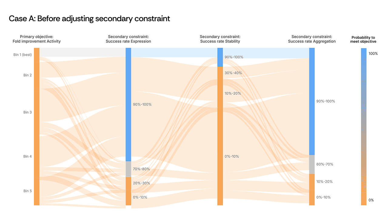
Case A: relieving a constraint bottleneck
In one campaign, the Sankey plot revealed a clear choke point at a secondary safety constraint. Sequences were passing all upstream objectives—activity, expression, primary selectivity—only to be eliminated en masse at this single filter. The river turned orange.
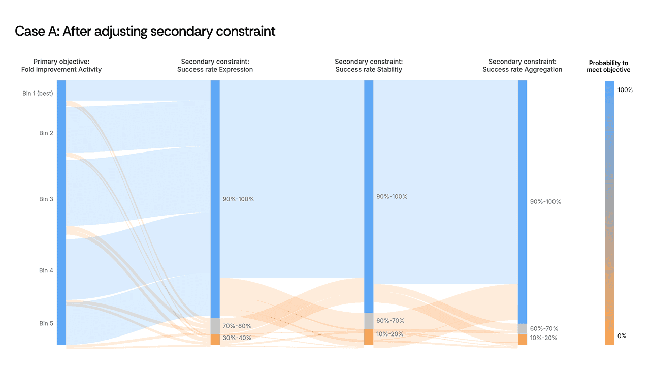
[Figure 2: Sankey plot showing the constraint bottleneck before and after adjustment]
The instinct might be to redesign the generation strategy entirely or to accept that these objectives are incompatible. Instead, the scientist made a targeted decision: dial back the secondary safety constraint by roughly 10%. The objective didn’t need to be abandoned, but we needed to recognize that the constraint threshold was set more stringently than the biology required, and that it was acting as a ceiling on every other property simultaneously.
As a result, the flow opened up. Sequences that had been eliminated now passed through all filters, including other secondary objectives whose thresholds had not been changed. By relaxing one over-specified constraint, the AI found design paths that satisfied the full set of criteria. The visualization made the bottleneck obvious; the scientist's judgment on constraint hierarchy made the solution possible.
Case B: the non-intuitive trade-off
A second example from an anonymized antibody campaign presented a different pattern. High-fluorescence sequences—the proxy for high activity—were flowing directly into the failure zone for developability. Activity and developability appeared mutually exclusive in the Sankey plot.
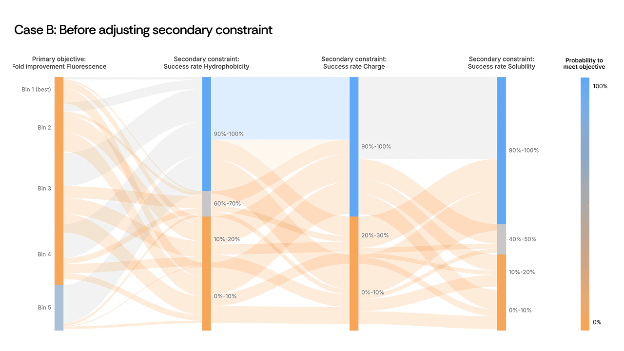
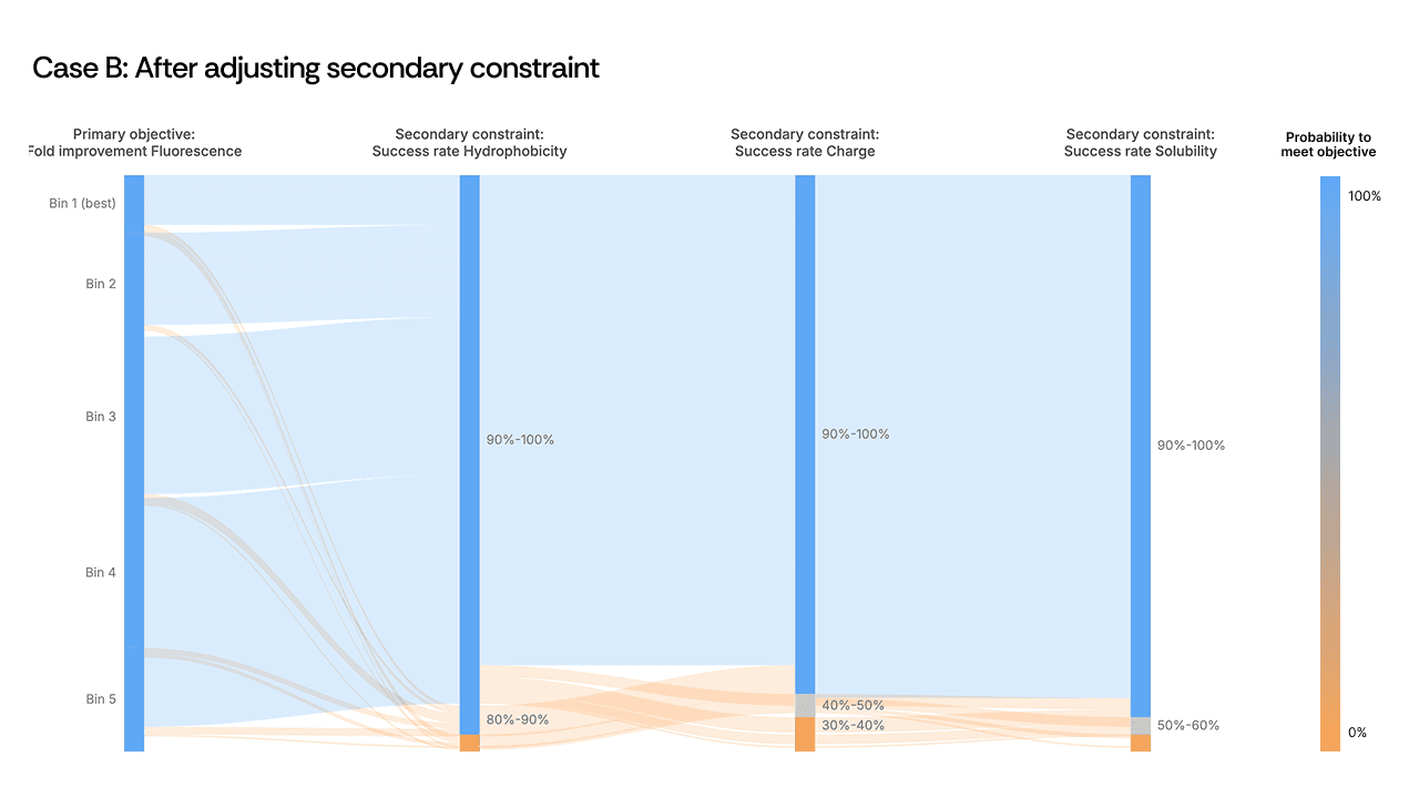
[Figure 3: Sankey plot showing the activity-developability trade-off before and after adjustment]
Here, the scientist loosened a secondary hydrophobicity constraint to give the model additional freedom. The expectation was modest: recover some developability without sacrificing too much activity. What happened was counterintuitive. The relaxed constraint did not merely fix stability: it boosted primary activity from 1.5× to 2.7× over the starting template. The AI, given slightly more room in sequence space, found a region where both properties improved in concert. The mutations in these top-performing variants were among the least intuitive in the entire design set, and among the most successful.
This is precisely the kind of outcome that sequential optimization misses. A scientist optimizing activity first would never have explored the region of sequence space where hydrophobicity was slightly relaxed, because it would have appeared irrelevant to the primary objective. The Sankey plot made the coupling visible; the scientist's decision to act on it unlocked a design space the model could not have reached under the original constraints.
The scientist stays in the loop
Both cases illustrate the same principle: AI-driven protein engineering is most powerful when the scientist actively guides the generation strategy, and visualization is the mechanism that makes that guidance precise. The model can evaluate millions of sequences across multiple properties simultaneously—something no human can do manually. But the strategic decisions about which constraints matter most, which thresholds to tighten or relax, and which trade-offs are acceptable for a given program remain squarely with the scientist.
Sankey plots are one example of how we are building Cradle to support this kind of iterative, scientist-driven workflow. The goal is not to automate the scientist out of the loop, but to give them tools that make the AI's logic auditable and actionable before a single dollar is spent in the lab. None of this replaces wet lab validation, it sharpens it.
When scientists can see exactly where designs are predicted to fail, and why, they walk into the next round with a better plate of candidates and a clearer hypothesis, ultimately shaving significant time off the discovery and optimization process by reducing the number of DBTL cycles.
A lead candidate with exceptional on-target activity that fails in process development six months later is a common result of sequential property optimization. Optimizing binding first, then function, then developability, then expression treats each property as independent when, in practice, they are deeply coupled.
There are significant downstream effects of this step-by-step protein optimization:
Designs tend to cluster in small areas of proteomic space, which can miss completely novel changes that may not be readily apparent
R&D timelines become longer, because every optimization step has to be validated in the wet lab
Molecules ultimately do not fully meet the desired target product profile (TPP)
Multi-property optimization is a key use case for AI-driven protein optimization: AI thrives in the multi-parametric sequence space that is difficult to grasp for human scientists alone. But whether scientists can steer that exploration toward designs that satisfy all constraints simultaneously or not requires visibility into where designs are succeeding and where they are failing, before any of them reach the bench.
Sankey plots as an audit layer
At Cradle, we use Sankey plots as a core visualization for multi-property generation campaigns. The concept is straightforward: think of your generated sequences as a river flowing through a series of filters. Each vertical bar on the x-axis represents one of your defined objectives; on-target activity, expression level, stability, a safety constraint, a developability threshold. The flowing bands are your sequences. Blue means the sequence passes the filter; orange means it fails.
[Figure 1: Example Sankey plot showing sequence flow across multiple objectives]
What makes this immediately useful is pattern recognition. If the river turns predominantly orange at a specific constraint, you have identified the bottleneck in your design space, not by reading through hundreds of rows in a spreadsheet, but at a glance. More importantly, the Sankey plot becomes a decision-making tool. It tells you which constraint to interrogate, which parameter to relax, and where the AI needs more room to manoeuvre.
An important caveat: these are predicted outcomes. The sequences flowing through the Sankey plot have not yet been synthesized or tested, which is what our customers do in their wet lab. What it gives you is high confidence going into a wet lab round: you have eliminated designs that were dead on arrival and focused your experimental budget on the sequences most likely to meet your full target product profile. That distinction matters, because the value is not in replacing experimental validation but in making each round of it count.
Let’s look into two practical examples of exactly that. The data is fictitious, but both examples are based on real case studies.
Case A: relieving a constraint bottleneck
In one campaign, the Sankey plot revealed a clear choke point at a secondary safety constraint. Sequences were passing all upstream objectives—activity, expression, primary selectivity—only to be eliminated en masse at this single filter. The river turned orange.
[Figure 2: Sankey plot showing the constraint bottleneck before and after adjustment]
The instinct might be to redesign the generation strategy entirely or to accept that these objectives are incompatible. Instead, the scientist made a targeted decision: dial back the secondary safety constraint by roughly 10%. The objective didn’t need to be abandoned, but we needed to recognize that the constraint threshold was set more stringently than the biology required, and that it was acting as a ceiling on every other property simultaneously.
As a result, the flow opened up. Sequences that had been eliminated now passed through all filters, including other secondary objectives whose thresholds had not been changed. By relaxing one over-specified constraint, the AI found design paths that satisfied the full set of criteria. The visualization made the bottleneck obvious; the scientist's judgment on constraint hierarchy made the solution possible.
Case B: the non-intuitive trade-off
A second example from an anonymized antibody campaign presented a different pattern. High-fluorescence sequences—the proxy for high activity—were flowing directly into the failure zone for developability. Activity and developability appeared mutually exclusive in the Sankey plot.
[Figure 3: Sankey plot showing the activity-developability trade-off before and after adjustment]
Here, the scientist loosened a secondary hydrophobicity constraint to give the model additional freedom. The expectation was modest: recover some developability without sacrificing too much activity. What happened was counterintuitive. The relaxed constraint did not merely fix stability: it boosted primary activity from 1.5× to 2.7× over the starting template. The AI, given slightly more room in sequence space, found a region where both properties improved in concert. The mutations in these top-performing variants were among the least intuitive in the entire design set, and among the most successful.
This is precisely the kind of outcome that sequential optimization misses. A scientist optimizing activity first would never have explored the region of sequence space where hydrophobicity was slightly relaxed, because it would have appeared irrelevant to the primary objective. The Sankey plot made the coupling visible; the scientist's decision to act on it unlocked a design space the model could not have reached under the original constraints.
The scientist stays in the loop
Both cases illustrate the same principle: AI-driven protein engineering is most powerful when the scientist actively guides the generation strategy, and visualization is the mechanism that makes that guidance precise. The model can evaluate millions of sequences across multiple properties simultaneously—something no human can do manually. But the strategic decisions about which constraints matter most, which thresholds to tighten or relax, and which trade-offs are acceptable for a given program remain squarely with the scientist.
Sankey plots are one example of how we are building Cradle to support this kind of iterative, scientist-driven workflow. The goal is not to automate the scientist out of the loop, but to give them tools that make the AI's logic auditable and actionable before a single dollar is spent in the lab. None of this replaces wet lab validation, it sharpens it.
When scientists can see exactly where designs are predicted to fail, and why, they walk into the next round with a better plate of candidates and a clearer hypothesis, ultimately shaving significant time off the discovery and optimization process by reducing the number of DBTL cycles.
Recent posts
Subscribe and get new posts and updates from Cradle straight to your inbox.


Follow Cradle
Built with ❤️ in Amsterdam & Zurich
Follow Cradle
Built with ❤️ in Amsterdam & Zurich
Follow Cradle